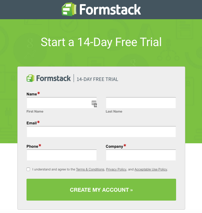
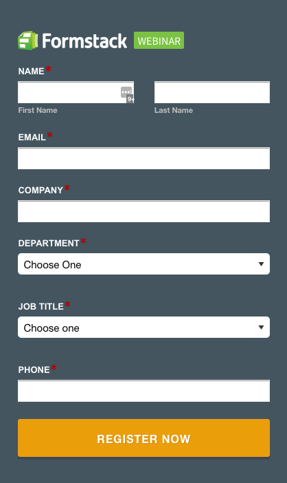
Does your form have abandonment issues? If it’s not branded, it might.When customers click to your form, they need reassurance that their information is secure. Branded forms allow you to maintain a consistent experience for your customers so they don’t question your form and click away. Every abandoned form is a lost lead or sale, and we want to help you close the deal with your online forms. Let’s dig deeper into why an unbranded form can scare customers away. Here are the three main reasons:
#1: Visitors don’t believe the form is yours.
Security is a top priority for customers. Since an online form asks for personal information, it’s crucial that users feel confident in the source. If a form looks sketchy, visitors might worry they are being phished or scammed. If they don’t trust the form, they won’t want to enter their email address, let alone their credit card number.One report indicates that 92% of U.S. internet users are concerned about their online privacy. These people are likely on the lookout for suspicious websites. By branding your form, you provide a seamless experience for your customers. They go from your website to filling out the form without noticing any inconsistency or disturbance. Brand unity on a payment form or contact form allows you to communicate credibility and build brand trust. It also helps you assure skeptical customers that the form is, indeed, yours.
#2: Visitors think you’re unprofessional.
Some customers are going to see an absence of branding as a lack of attention to detail. Since today’s consumers interact with brands in a variety of ways—on mobile devices, within social media sites, and more—they want to experience brand consistency across all platforms. Inconsistent branding can be a jarring experience.One study reports that 35% of potential buyers click away because they believe a “do it yourself site” reduces credibility. If you are asking customers to fill out a form, you are also asking them to trust you with their personal information. A professional website—including professional online, branded forms like the Formstack examples below—helps to establish your company’s validity and build brand trust among your visitors.


#3: Visitors see your brand as unlikable.
If your customers have a dissatisfying experience with your website, their opinion of your brand suffers. Most of us have had an experience with a frustrating website—one with broken links, a form that is a pain to fill out, or information that is hard to find. With so many competitors online, why bother with the hassle? A negative experience with a website can impact a customer’s opinion of your entire brand. Don’t let a lack of branded forms be an obstacle to gaining a customer; put the right components in place on your website to make it easy to interact with your company.
Create branded forms to give your users a clear, easy-to-use experience that helps them submit with confidence. Formstack offers an awesome Theme Editor that allows you to quickly include logos, your company colors, or even custom HTML and CSS. Sign up for a free trial here to try it out!


